


NCERT Solutions For Class 7 Maths Chapter 3 Data Handling Exercise 3.3 - 2025-26
NCERT Solutions for Class 7 Maths Chapter 3 - Data Handling Exercise 3.3 provide clear and concise explanations of data representation methods. This exercise focuses on bar graphs, double bar graphs, and their interpretation. Understanding these concepts is crucial as they form the foundation for data analysis, an important skill in mathematics and real-life applications.
 Table of Content
The solutions emphasize important points such as how to accurately draw and interpret bar graphs. Special attention is given to comparing different sets of data using double bar graphs. Students should focus on practicing these problems to build a strong understanding of data representation and analysis techniques. These solutions by Vedantu ensure that students grasp the essential concepts effectively.
Glance on NCERT Solutions Class 7 Maths Chapter 3 Exercise 3.3 | Vedantu
NCERT Solutions Maths Chapter 3 Exercise 3.3 Class 7 covers and focuses on data handling, including organizing and interpreting data using bar graphs.
Utilizes basic mathematical operations for data analysis and interpretation.
Interpret data effectively using two popular methods:
Bar graphs
Pictographs
There are links to video tutorials explaining class 7 chapter 3 Exercise 3.3 - Data Handling for better understanding.
There are three examples and 6 questions covered in NCERT Class 7th Maths Chapter 3 Exercise 3.3 Data Handling
1. Use the bar graph to answer the following questions:
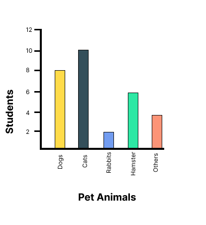
(a) Which is the most popular pet?
Ans: Since the bar representing cats is the tallest, Cat is the most popular pet.
(b) How many students have dog as a pet?
Ans: From the bar graph, 8 students have a dog as a pet.
2. Read the bar graph which shows the number of books sold by a bookstore during five consecutive years and answer the following questions:
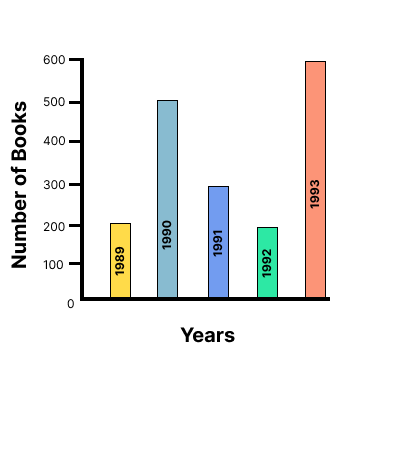
(i) About how many books were sold in 1989? 1990? 1992?
Ans: (a) In 1989, 180 books were sold.
(b) In 1990, 475 books were sold.
(c) In 1992, 225 books were sold.
(ii) In which year were about 475 books sold? About 225 books sold?
Ans: From the graph, in 1990, about 475 books were sold and in 1992, about 225 books were sold.
(iii) In which years were fewer than 250 books sold?
Ans: From the graph, it can be concluded that in 1989 and 1992 fewer than 250 books were sold.
(iv) Can you explain how you would estimate the number of books sold in 1989?
Ans: From the graph, it can be concluded that the number of books sold in the year 1989 is about 1 and \[\dfrac{3}{4}{\text{th }}\] part of \[{\text{1cm}}\].
We know that the scale is taken as \[{\text{1cm }} = {\text{ 100 books}}\].
\[100 + \dfrac{3}{4} \times 100 = 100 + 75 = 175\]
Therefore, about 175 books were sold in the year 1989.
3. Number of children in six different classes are given below. Represent the data on a bar graph.
(a) How would you choose a scale?
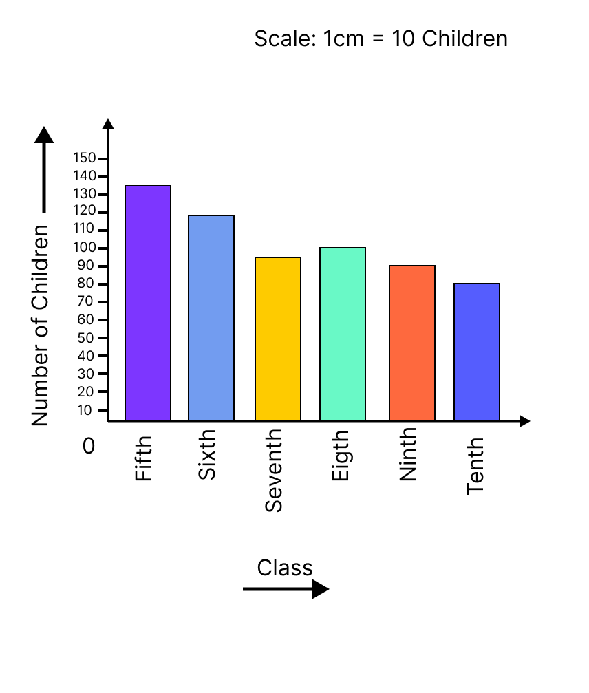
Ans: We will choose a scale as 1 unit = 10 children because we can represent a more clear difference between the number of students of class 7th and that of class 9th by this scale.
(b) Answer the following questions:
(i) Which class has the maximum number of children? And the minimum?
Ans: Since the bar representing the number of children for class fifth is the tallest, there are maximum number of children in class fifth. Similarly, since the bar representing the number of children for class tenth is the smallest, there are minimum number of children in class tenth.
(ii) Find the ratio of students of class sixth to the students of class eighth.
Ans: The number of students in class sixth is 120 and the number of students in class eighth is 100.
Therefore, the ratio \[{\text{ = }}\dfrac{{{\text{the number of students of class sixth}}}}{{{\text{the number of students of class eighth}}}}\]
\[ = \dfrac{{120}}{{100}} = \dfrac{6}{5} = 6:5\]
4. The performance of a student in \[{1^{st}}\] term and \[{2^{nd}}\] term is given. Draw a double bar graph choosing appropriate scale and answer the following:
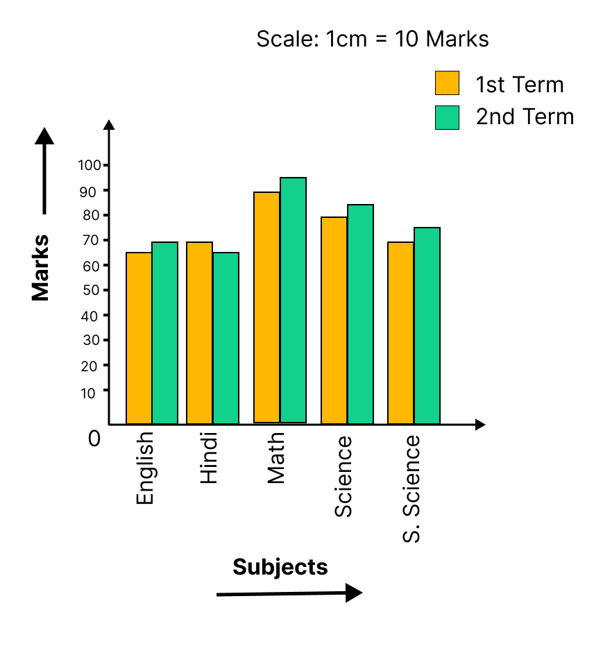
The difference of marks in both terms of each subject.
English \[ = 70 - 67 = 3\]
Hindi \[ = 65 - 72 = - 7\]
Maths \[ = 95 - 88 = 7\]
Science \[ = 85--81 = 4\]
S. Science \[ = 75--73 = 2\]
(i) In which subject has the child improved his performance the most?
Ans: There was a maximum increase in the marks obtained in Maths, which is 7 marks. Therefore, the child has improved his performance the most in Maths.
(ii) In which subject is the improvement the least?
Ans: From the graph, it can be concluded that he only improved 2 marks in S.Science. Therefore, the improvement was the least in S. Science.
(iii) Has the performance gone down in any subject?
Ans: From the graph, it can be observed, in Hindi his marks decreased from 72 to 65. Therefore, in Hindi, his performance has gone down.
5. Consider this data collected from a survey of a colony.
(i) Draw a double bar graph choosing an appropriate scale. What do you infer from the bar graph?
Ans: A double bar graph for the given data is as follows.

The double bar graph represents the number of people who like watching and participating in different sports. It can be observed that most of the people like watching and participating in cricket while the least number of people like watching and participating in athletics.
(ii) Which sport is most popular?
Ans: From the bar graph, it can be observed that the bar representing the number of people who like watching and participating in cricket is the tallest among all the bars. Hence, cricket is the most popular sport.
(iii) Which is more preferred, watching or participating in sports?
Ans: The bars representing watching sport are longer than the bars representing participating in sport. Hence, watching different types of sports is more preferred than participating in the sports.
6. Take the data giving the minimum and the maximum temperature of various cities given in the beginning of this Chapter. Plot a double bat graph using the data and answer the following:
(i) Which city has the largest difference in the minimum and maximum temperature on the given data?
Ans: A double bar graph for the given data is constructed as follows.

From the graph, it can be concluded that Jammu has the largest difference in its minimum and maximum temperatures on 20.6.2006.
i.e. Maximum temperature \[ = \]\[{41^ \circ }{\text{C}}\] Minimum temperature \[ = \]\[{26^ \circ }{\text{C}}\]
Therefore, Difference \[ = {41^ \circ }{\text{C}} - {26^ \circ }{\text{C = }}{15^ \circ }{\text{C}}\]
(ii) Which is the hottest city and which is the coldest city?
Ans: From the graph, it can be concluded that Jammu is the hottest city due to maximum temperature and Bangalore is the coldest city due to lowest minimum temperature.
(iii) Name two cities where maximum temperature of one was less than the minimum temperature of the order.
Ans: Bangalore and Jaipur, Bangalore and Ahmedabad.
For Bangalore, the maximum temperature was \[{28^ \circ }{\text{C}}\], while minimum temperature of both cities, Ahmedabad and Jaipur, was \[{29^ \circ }{\text{C}}\].
(iv) Name the city which has the least difference between its minimum and the maximum temperature.
Ans: From the graph, it can be concluded that the city which has the least difference between its minimum and maximum temperatures is Mumbai.
i.e. Maximum temperature \[ = {32^o}{\text{C}}\]Minimum temperature \[ = {27^o}{\text{C}}\]
Therefore, Difference \[ = {32^o}{\text{C}} - {27^o}{\text{C}} = {5^o}{\text{C}}\]
Conclusion
The NCERT Solutions for Maths Exercise 3.3 of Class 7 Chapter 3 on Data Handling focuses on teaching students how to organize and interpret data using various methods like bar graphs and pictographs. Important points include understanding how to collect data, create frequency tables, and represent data visually. It’s crucial to focus on the steps of drawing and interpreting bar graphs. Emphasizing data interpretation and graph creation. Practicing these concepts will help build a strong foundation in data handling.
Class 7 Maths Chapter 3: Exercises Breakdown
CBSE Class 7 Maths Chapter 3 Other Study Materials
Chapter-Specific NCERT Solutions for Class 7 Maths
Given below are the chapter-wise NCERT Solutions for Class 7 Maths. Go through these chapter-wise solutions to be thoroughly familiar with the concepts.
Important Related Links for NCERT Class 7 Maths
Access these essential links for NCERT Class 7 Maths, offering comprehensive solutions, study guides, and additional resources to help students master language concepts and excel in their exams.

FAQs on NCERT Solutions For Class 7 Maths Chapter 3 Data Handling Exercise 3.3 - 2025-26
1. How do you solve for the arithmetic mean in the NCERT Solutions for Class 7 Maths Chapter 3?
To find the arithmetic mean, you follow a simple two-step method as per the NCERT guidelines. First, add up all the observations in the given dataset. Second, divide the sum by the total number of observations. The result is the mean, which represents the average value for the problem.
2. What is the correct method to find the range of a dataset as per Chapter 3, Data Handling?
The correct method to calculate the range is to first identify the highest and lowest values in the dataset. Then, subtract the lowest value from the highest value. The formula is: Range = Highest Observation - Lowest Observation. This step is crucial for understanding the spread of data in an exercise.
3. How do you determine the mode for a set of observations in the Class 7 Maths NCERT solutions?
To find the mode, you must first arrange the data to make counting easier. The mode is the observation that appears most frequently in the dataset. For example, in the data set {2, 3, 4, 3, 5, 3}, the number '3' appears most often, so the solution for the mode is '3'. A dataset can have more than one mode.
4. What is the step-by-step process for finding the median in NCERT Class 7 Maths Chapter 3?
The correct process for finding the median involves these steps:
- First, arrange the given data in ascending or descending order.
- Next, count the total number of observations (n).
- If 'n' is an odd number, the median is the middle value, which is the ((n+1)/2)th observation.
- If 'n' is an even number, the median is the average of the two middle values.
5. How are questions on double bar graphs solved in the exercises for Chapter 3?
To solve problems using a double bar graph, you must first understand what each bar represents, as the graph compares two sets of data side-by-side. To find a solution, you should:
- Read the title and the axes to understand the data.
- Use the scale on the y-axis to determine the value of each bar.
- Compare the heights of the two bars for a specific category to find the difference, sum, or ratio as asked in the question.
6. Why is choosing between mean, median, and mode crucial for correctly solving problems in Data Handling?
Choosing the correct representative value is crucial because each one provides a different insight into the data, which affects the solution's accuracy.
- The mean is best for a general average but can be misleading if there are extreme values (outliers).
- The median provides a better solution for the central point when the data has outliers.
- The mode is the only measure that can be used for categorical data and helps find the most frequent item.
7. What are the common mistakes to avoid when solving problems in Chapter 3, Data Handling, for the 2025-26 session?
Common mistakes to avoid for an accurate solution include:
- Forgetting to arrange the data in ascending order before finding the median. This is the most frequent error.
- Calculating the mean by dividing by the wrong number of observations.
- Misreading the scale on a bar graph, leading to incorrect data values.
- When solving for the mode, only listing one number when there might be multiple modes.
8. How does calculating the range help in providing a complete solution for a data problem?
While the mean, median, and mode describe a central value, the range provides crucial context about the data's spread. A small range indicates that the data points are clustered, making the mean a reliable representative value. A large range suggests the data is widely spread and might contain outliers, indicating that the median might be a more appropriate measure for the solution.
9. What is the correct way to label the axes when constructing a bar graph for an NCERT exercise?
To correctly construct and solve problems with a bar graph, the horizontal axis (x-axis) should represent the categories of data (e.g., subjects, years, favourite colours). The vertical axis (y-axis) must represent the numerical values or frequency. It is essential to choose an appropriate and consistent scale for the y-axis that covers the full range of data and is easy to read.
10. When a problem requires comparing data for two groups, why is a double bar graph the correct tool for the solution?
A double bar graph is the correct tool because it is specifically designed for direct, visual comparison of two related datasets across the same categories. For each category (e.g., a student), you can place two bars side-by-side—one for each group (e.g., marks in Test 1 vs. Test 2). This allows for an immediate comparison, making it a more efficient method for solving such problems than using two separate single bar graphs.